 Gina Marie Triplett
Travel gets overwhelming fast. Most airline apps add to the stress. The challenge was to design a calm, intuitive mobile experience that feels easy in high-pressure moments.
The Challenge
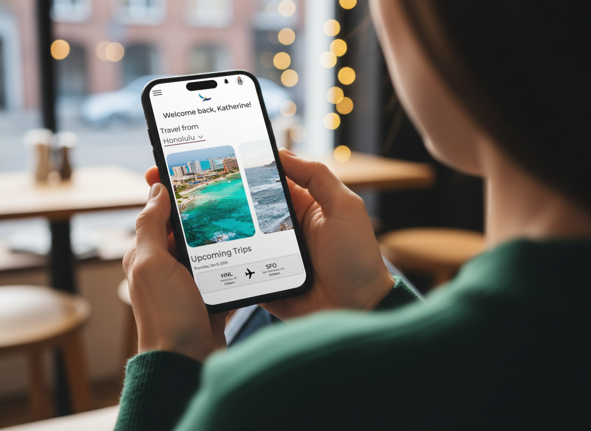
I designed the app to feel simple, intuitive, and easy to move through. Every feature is there to make things smoother, not more complicated. Instead of overwhelming users with options, I focused on what actually matters — check-in, seat changes, trip details, and real-time updates — all organized in a way that feels clear and predictable.
The Solution
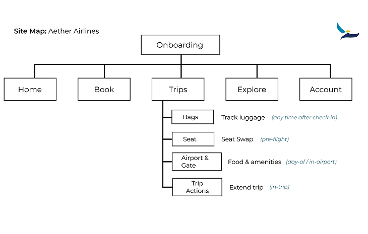
My Approach
Designing for
Moments That Matter
Travel can feel overwhelming, especially when plans change quickly. I focused on bringing the most important information forward, helping travelers move through each step with more ease and less friction.
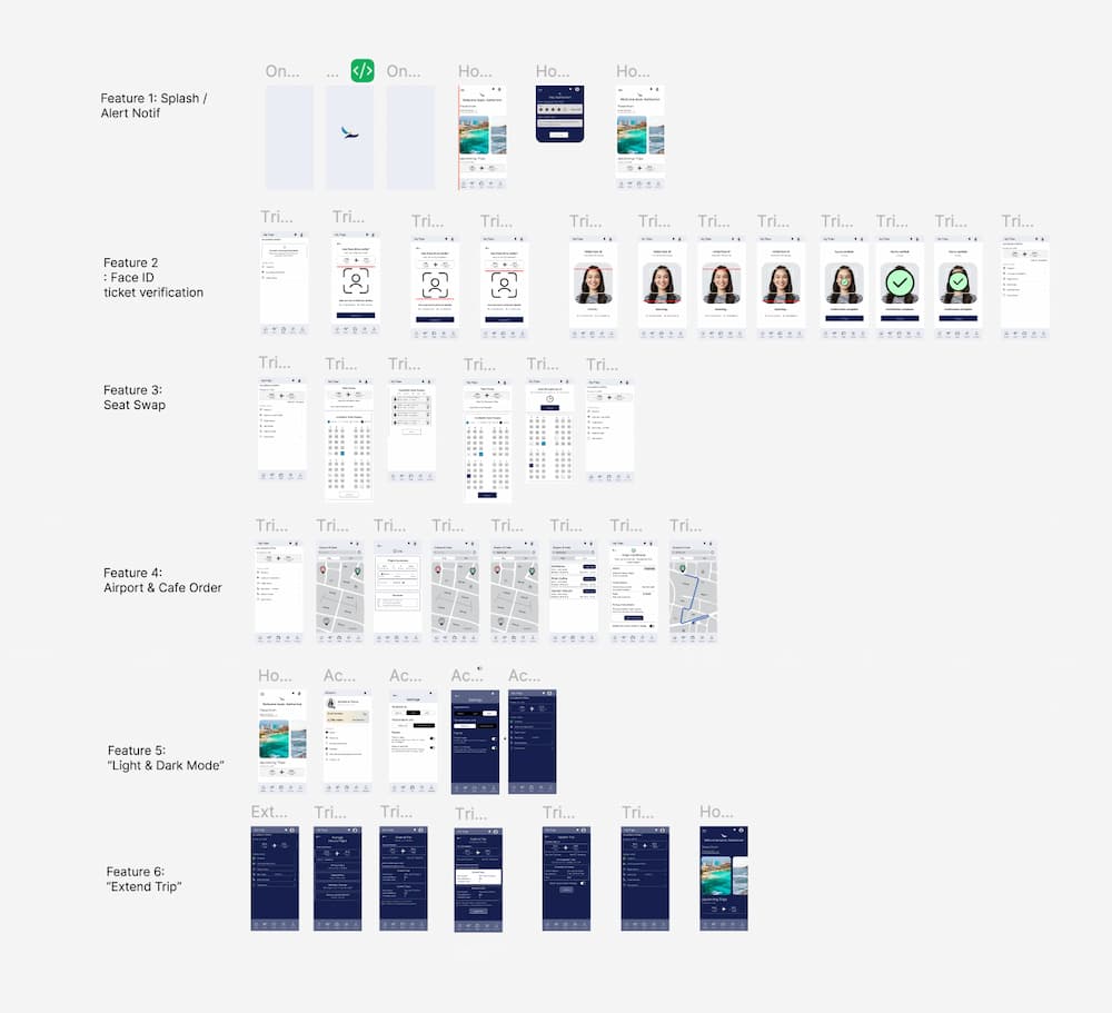
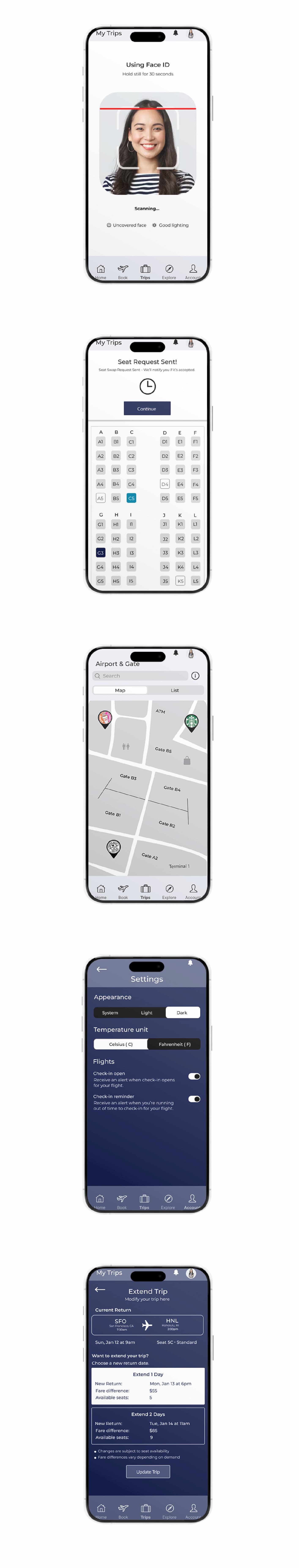
FEATURE 1: FACE ID FOR TICKET VERIFICATION
Effortless check-in through secure Face ID biometric verification designed for speed, privacy and ease.
FEATURE 2: SEAT SWAP
An elevated seat-swap experience that gives passengers the freedom to move, adjust, and travel in total comfort without hassle.
FEATURE 3: AIRPORT MAP & FOOD ORDERS
A refined in-app airport guide that lets travelers effortlessly navigate dining, shopping, and essential amenities.
FEATURE 4: LIGHT/DARK MODE
A customizable light and dark mode that enhances visual comfort in a dark lighting environment.
FEATURE 5: EXTEND TRIP
A seamless trip extension feature that allows travelers to modify and extend their journey with ease.
Final Thoughts
The Aether Airlines app is designed to make stressful travel moments feel more manageable. By focusing on real behaviors and flexible tools, it becomes more than just a booking app — it becomes part of the journey. This project reflects my approach to mobile design: creating experiences that balance function with feeling.