 Gina Marie Triplett
Design an airline website that feels calm and immersive without sacrificing clarity or usability. Most airline websites prioritize speed and density, often overwhelming users with information. The challenge was to create a structure that supports storytelling while still guiding users efficiently through key content.

The Challenge
I designed a modular, scroll-based website that uses motion and spacing to guide attention rather than overwhelm it. Subtle scroll-trigger animations, restrained transitions, and a clear content hierarchy allow users to explore the brand at a relaxed pace while maintaining intuitive navigation.
The Solution
My Approach
Designing
Through Scroll
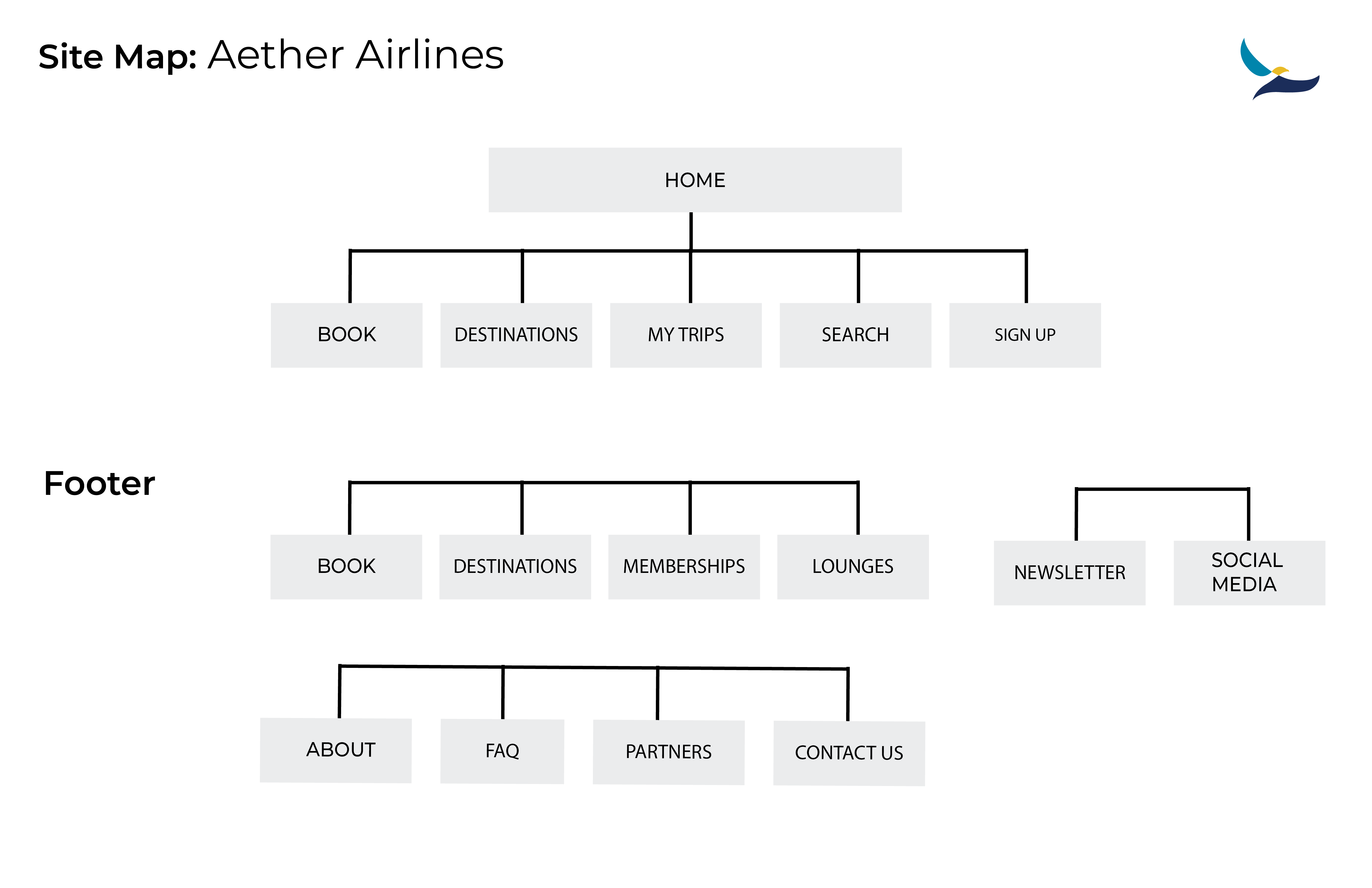
I treated the website like a guided journey rather than a series of separate pages. Each section was designed to unfold naturally, helping users move through the brand story in a way that feels calm, immersive, and easy to follow.
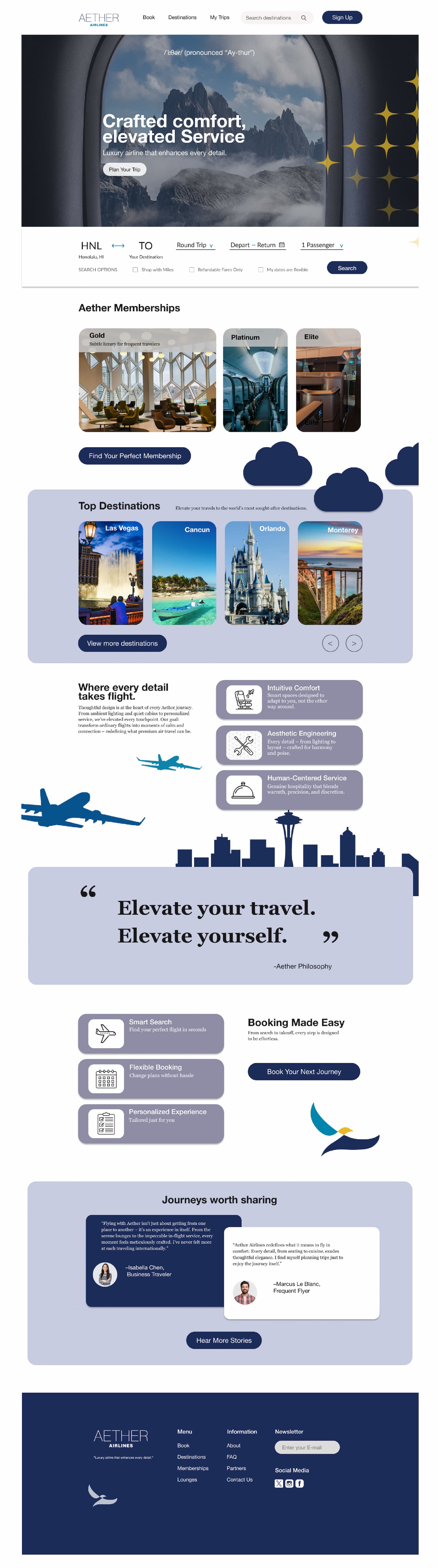
Strong Visual Entry Point
Clear, focused messaging
from the start
Card-Based Layout
Interactive cards expand on hover to reveal
more detail
Horizontal Carousel
Encourages exploration
across destinations
Simplified information
Reduces cognitive load
through clear hierarchy
Primary Action
Clear and consistent
CTA placement
Testimonials
Streamlined layout for
readability and trust
Footer
Structured navigation
with integrated search
Final Thoughts
The Aether Airlines website demonstrates how brand identity can be translated into interaction and motion. By using scroll-based structure and subtle animation, the site becomes an extension of the brand’s philosophy—intentional, calm, and human-centered. This project reflects my approach to designing digital experiences that prioritize emotion while remaining usable and scalable.