Gina Marie Triplett

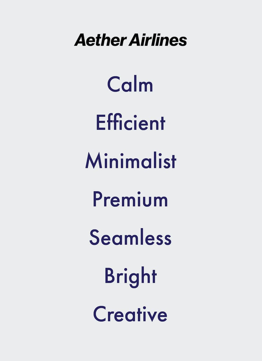
Airlines usually focus on being fast and loud, but Aether focuses on the vibe. The challenge was making it feel “quiet luxury”—intentional and nice, but still friendly and easy to use.
The Challenge
I built a brand system that’s all about softness and clarity. I used clean fonts and calm colors to make the whole experience feel lighter and less overwhelming—less “flashy” and more “quietly confident.”
The Solution
My Approach
Leading with the Vibe
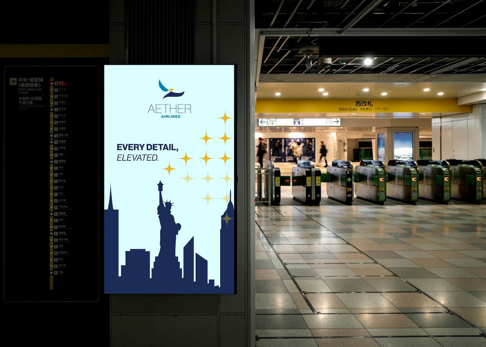
Airports are stressful, so I designed Aether to be the opposite. I focused on a vibe that feels calm and quiet luxury, making the brand feel composed and easy instead of rushed and loud.
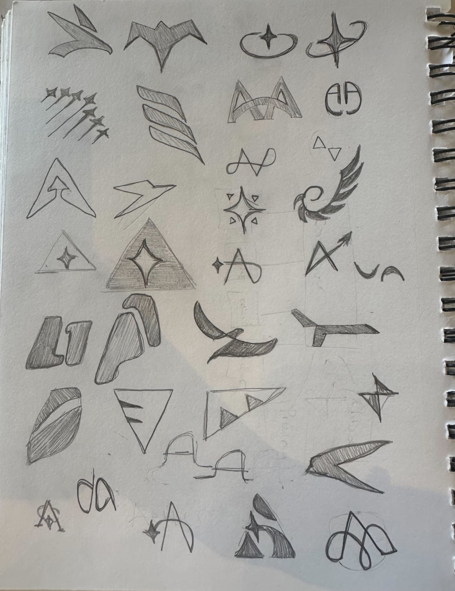
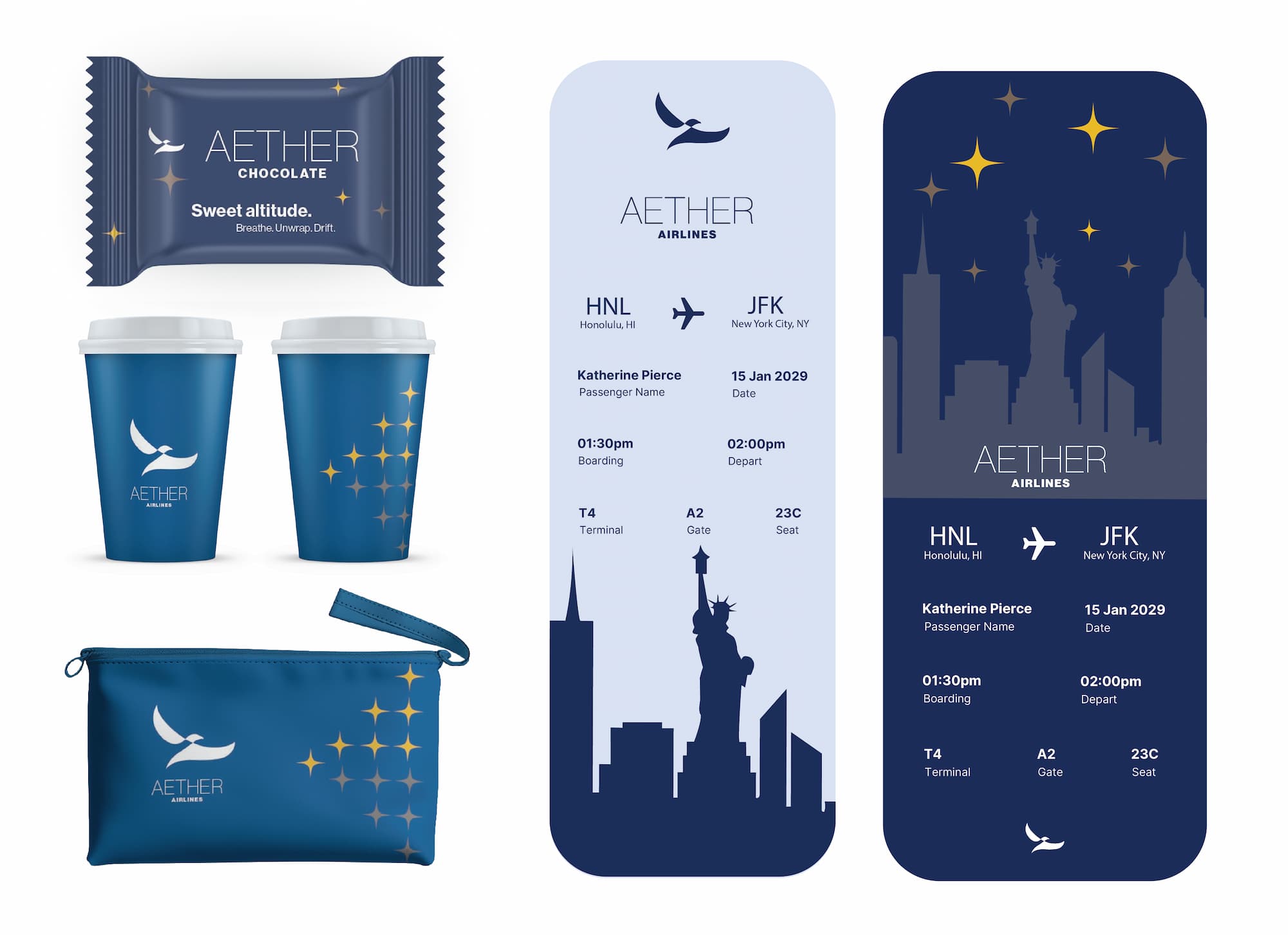
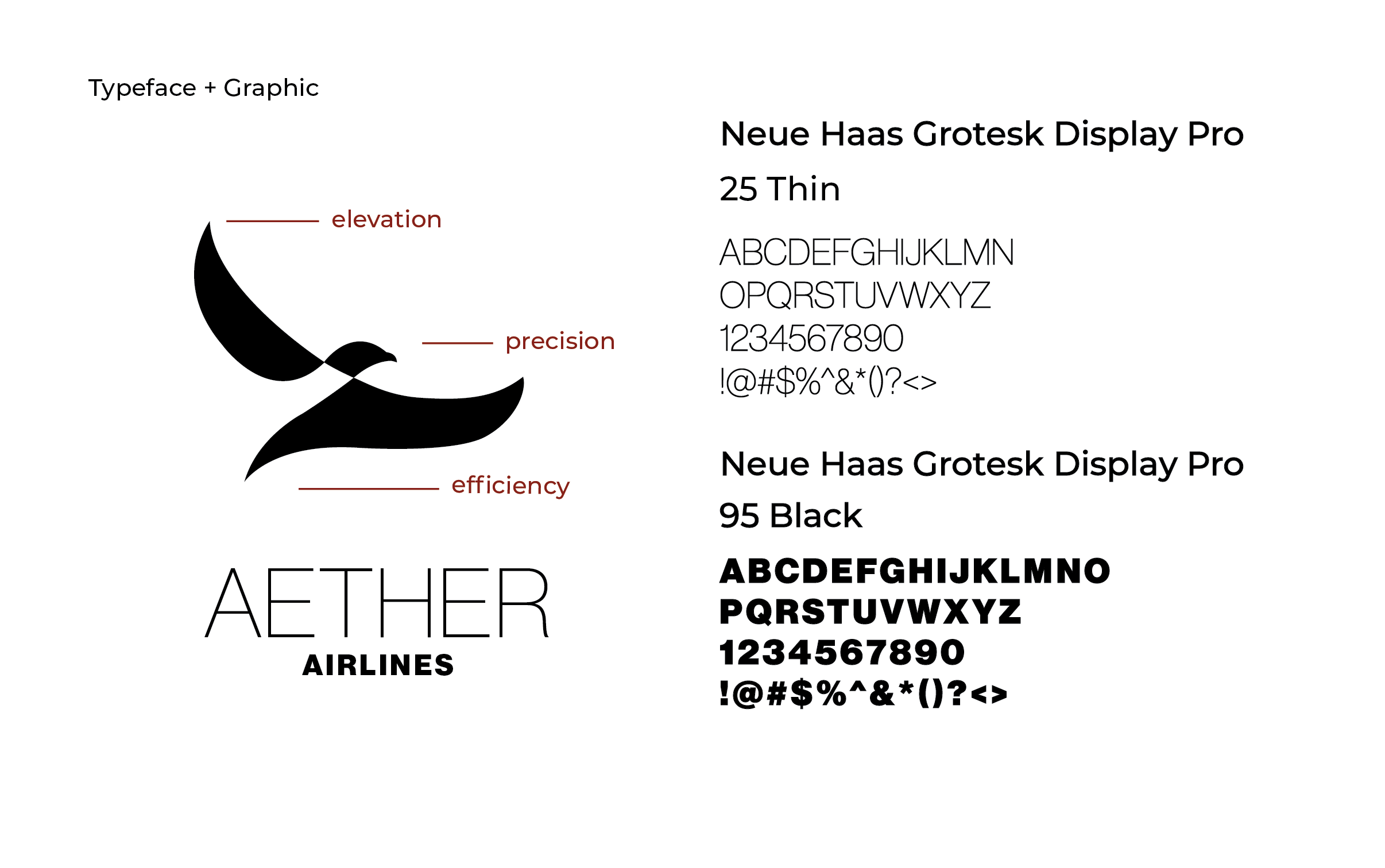
Creating a Simple Logo
I kept the logo light and clean to match the feeling of easy travel. The final mark balances simplicity and precision, creating a modern identity that feels elevated without becoming overly complex.
Keeping Visuals Minimal
Soft colors and clean typography help reinforce a calm and polished tone. Together, these elements create a minimal visual system that feels intentional, refined, and easy to move through.


Final Thoughts
Aether Airlines reflects how I approach branding as more than just visuals — it’s about shaping the full experience. I’m especially interested in how design can create a sense of calm and clarity in high-stress moments like travel. This project shows how I take an abstract idea and turn it into something thoughtful, cohesive, and easy to use. Looking ahead, Aether could extend naturally into digital booking, environmental graphics, and in-flight experiences.